Monday 24 November 2014

Photo shoot for Magaizne front cover


I like this photo as it is more serious than the previous photograph as it suit my genre. I also looked at Q and Billboard magazine where I take my inspiration from and they use very close up photographs of people faces This would suit my genre as it is slightly rebellious however I think it is too much of a close up. Other magazine have the shots slightly further away which I feel would suit my magazine as It would make it less busy.


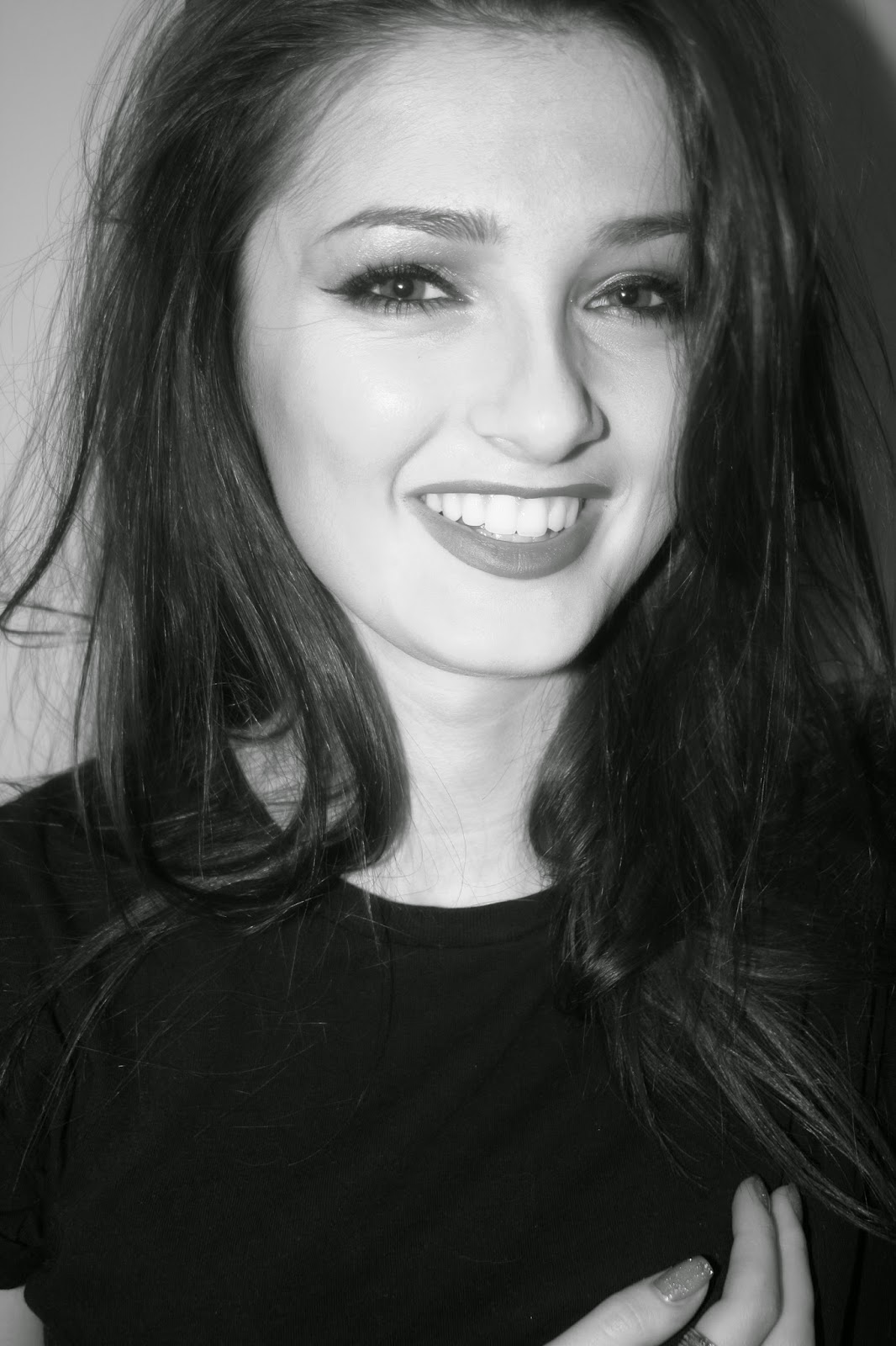
 I like this photograph because it suits the pop genre of my magazine and it is lively and happy. However I am creating a more rebellious magazine and I feel like this photograph is too lively for the magazine and doesn't go with the genre.


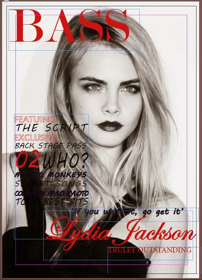
This photo has been taken from a wider angle I have managed to capture more of the lower part which when I shall add to my cover lines the photograph will be easily seen through the negative spaces around the edge. I think that the photograph will connote a rebellious feel and the red against the black and white will make it look classy. This will suit my genre as that music connotes those feelings. 

Where - Inside against a plain white wall
What is she wearing - A plain black tee - shirt and black jeans


Thursday 20 November 2014

Progress of production


Progress


I have continued to work on my strap lines and the smaller cover lines underneath.
  • I changed the colours to help work with the background this makes them stand out from it. 
  • I've kept with using the same 3 fonts so their isn't to much variation
  • The sizes are being varied like the mark scheme asks
The Masthead has been developed by changing the font to suit my target audience of older teenagers but making it look modern and classy. The colours contrast with the black and white background and the head shot. I have also developed the fonts by now using a more modern font this also reflects the music genre as it is simple.

Wednesday 19 November 2014

Time management update

I am up to date with the production of my music magazine. The cover lines and heading are done. I am behind on my photo shoot it has been scheduled for Saturday morning which I can then add into my magazine by Monday.

Thursday 13 November 2014

Production Work


I have continued with my production of my magazine front cover. I have used one of the fonts from my previous masthead work and changed the word as I have decided on a name. The letters are not filled in so the masthead looks modern. The lines I have added a stroke to make it look bolder and stand out. This connotes a sense of boldness. As well as my masthead I have started to work on my cover lines. I have changed it from my original page layout as when I looked at music magazine they have all their cover lines to one side of the page. I have used different size fonts and colours and contrasted against other words. This makes the front page look fun which is relevant to my target audience.